Design
Synergy is Dead. Long Live Aesthetics.
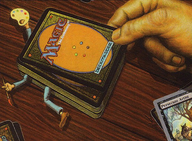
In 2015, on the eve of Oath of the Gatewatch, Jason Waddell was asked by a reader of his cube design column how to make their cube games feel unique and exciting, rather than a “mirror match of generically good cards”. Jason then distilled an era of Cube design into one sentence: “Make your cube about something.”
That “something,” in 2015, meant mechanical synergy, designing a set of archetypes that would make your custom Limited format feel unique and fresh. In the decade since, the cube world has deeply internalized that sentiment, from Carmen Klomparens’ Proliferate Cube to Caleb Gannon’s Powered Synergy Cube or even the absurdly committed 100 Ornithopters. A cube’s biggest selling point is no longer its power alone, but its mechanical novelty.
But those cubes largely took for granted one major design choice, that of art and flavor. Magic’s recent embrace of Universes Beyond and radical new in-universe settings has generated new mechanics, yes, but also incredibly bold visions for the art and flavor that decorate Magic’s rules engine. Selecting the right synergies is no longer the only job of a Cube designer. Synergy is dead. Long live aesthetics.
A New Aesthetic Era
The video essayist Rhystic Studies marks Magic’s trend towards aesthetic free-for-all with a 2024 direct-to-consumer Secret Lair for Spongebob Squarepants. To Sam, Patrick Star’s text box is the most irrelevant that Magic rules text has ever been. It is a meme, meant to be looked at rather than played with.
Magic’s very willingness to entertain such aesthetic departures is a radical departure from the game’s roots, one with profound impacts for Cube design. Before 2019 or so, the Cube format could take for granted that a cube would have an internally consistent aesthetic that felt like an homage to D&D. Sure, maybe the Un-cubes or the Foglio arts were the silliest, and the Invasion cubes were the grungiest, and the Innistrad cubes were spookiest, but all were variations on a shared universe. If Magic were a Indian restaurant, then maybe you’d see some coastal or Himalayan dishes, or maybe a clever cross-cultural fusion (I’ve had divine samosa pizza), but it’s all the same cuisine — you could order two dishes at random and be almost certain the tastes would harmonize.
In 2025, that default aesthetic baseline has shifted. That Indian restaurant has dropped the saag paneer and the samosa chaat in favor of bottomless margaritas and store-brand Big Macs. As Cube designers pulling from Magic’s menu to create our own custom Limited formats, we now have a whole new kind of choice to make, one of aesthetics. Let’s talk about some contours of that choice.
Crossover Event Aesthetics
Some people were the kind of kids who threw all their toys in one big box, Legos and BRATZ and Beyblades and Nerf like their living room is “The Ultimate Showdown of Ultimate Destiny”. Psycho behavior, in my opinion, but I get the appeal when it pops up in Magic’s canon:
When your media franchise has no planned ending (like comic books, or trading card games), a crossover provides narrative hype and unique team-up stories. Historically, many of the first cubes enacted this aesthetic when they pulled the most powerful or nostalgic cards from Magic’s universe into a single format. It’s an easy extension to apply the Crossover Event Aesthetic to any universes beyond Magic’s canon, too.
A crossover’s maximalist, campy approach can offers something for everyone to love, but it’s still important to set tone. If my cube is meant as a skill-testing chess-like puzzle for my hardcore gamer friends, then the metatextual Deadpool, Trading Card or GO TO JAIL might set misleading expectations versus more self-serious alternatives. On the other hand, goofy crossover cards would be perfect in a beer-and-pretzels cube meant to create high-variance stories. Think of it like this: enabling Super Smash Bros. items like “bunny ears” or “golden hammer” turns the multiplayer brawler from a tense battle of wits into an uproarious party game, and the silliness of Luigi in bunny ears helps sell the gameplay change. The art and flavor of a cube pack is likewise the first ambassador of gameplay.
Magic’s newfound variety of aesthetic is just another tool that Cube designers can use. It offers the designer more power, but carries more responsibility too.
How to Pick and Choose
When it comes to player immersion, aesthetic is often more important than mechanic. If you sit down to play my brand-new “Horror Cube,” and your first pack contains Crumb and Get It and Rat in the Hat, then this isn’t a horror cube, no matter how well my mechanical archetypes are supported!
It’s not only pulpy staples like horror that benefit from a strong aesthetic vision. Choosing a single aesthetic can heighten player immersion in any game world. Heck, immersion is the reason that most Magic sets don’t feature multi-planar crossovers!
The common theme here is aesthetic restraint. For example, if you go a high-fantasy route meant to showcase Magic’s most epic characters, then maybe you can get cheeky with an unnamed orc or elf, but probably not splashy franchise faces, especially if they lean more sci-fi or contemporary. Similarly, a high-power cube that prioritizes gameplay may still benefit from the classic Magic flavor that won’t divert player attention from the strategic decisions. The more important a goal immersion is, the less aesthetic wiggle room a cube will hold.
Aesthetic restraint can also be a way to manage visual complexity. In the early days of Secret Lair, I made it my mission to collect one of every showcase frame for my powerful Eternal cube, like a personal art museum. As new frame styles kept accumulating, the sheer visual variety began to overwhelm me, even manifesting as art-related misplays. Nowadays, in my newer cubes, I choose only one or two styles of bling, and add as many examples as I can. Repetition creates familiarity, with aesthetics as well as mechanics.
Just like art cues players into the kind of gameplay to expect, the right cube name can set expectations for the aesthetic. Don’t believe me? I’ll name three nostalgia-focused cubes, and you decide which one includes camp in its aesthetic vision: The Neoclassical Cube; The Museum of Modern; and The Cube Version of the Twilight Saga: New Moon Soundtrack. Let’s try again. Find the dime-novel horror cube that will have the most sternfaced art: Monster Mash, Girls’ Night, or Pulp Nouveau. Because an introduction to a new cube usually starts with its name, names are incredibly powerful design tools.
Cube is rightly seen as the best format to opt in to (or out of) the broader trends of Magic. But, whether you embrace all of Magic’s new aesthetics, only some, or none at all, cube designers now have an aesthetic design choice to make, when before there was only a default.
Thoughtful aesthetics can set mechanical expectations, heighten player immersion, and create new game worlds. We have the opportunity to design our cubes’ aesthetics as intentionally as Jason Waddell urged his readers to consider mechanics and gameplay. Make your cube about a synergy, yes! But make it about an aesthetic, too.